If you had to guess, how many ads do you think you’re exposed to each day? 10? 20? 100? Try an estimated 5,000! From digital to print, ads are everywhere and almost everything is an ad. At some point, the human brain starts to unconsciously filter the information we are exposed to — leaving most of these ads forgotten or completely unnoticed. That’s why effective signage design is critical for helping your message break through the noise.
The legendary “Rule of 7” states that consumers need to hear or see a message seven times before they will take action. It’s pretty clear that advertising isn’t so easy. In a congested market, countless businesses and organizations are fighting for attention. With money being dumped into digital ads on platforms like Facebook and Instagram, do print ads still work?
Yes.
There is a lot of data out there to support why print advertising is still a smart and successful investment. For example, studies suggest that print converts more customers compared to digital ads. Print can also work side-by-side with digital ads to help reinforce and elevate a message. However, most importantly, people engage differently with print compared to digital. Research shows that print advertising better stimulates parts of the brain that are responsible for desire and valuation. Studies on the same topic also suggest that print ads provide greater ease for understanding and longer attention periods compared to their digital counterparts.
So, yes, print isn’t dead. But how do you still stand out amongst the competition? We’ve compiled three ways you can enhance your print signage design for better engagement and reach with your target audience.

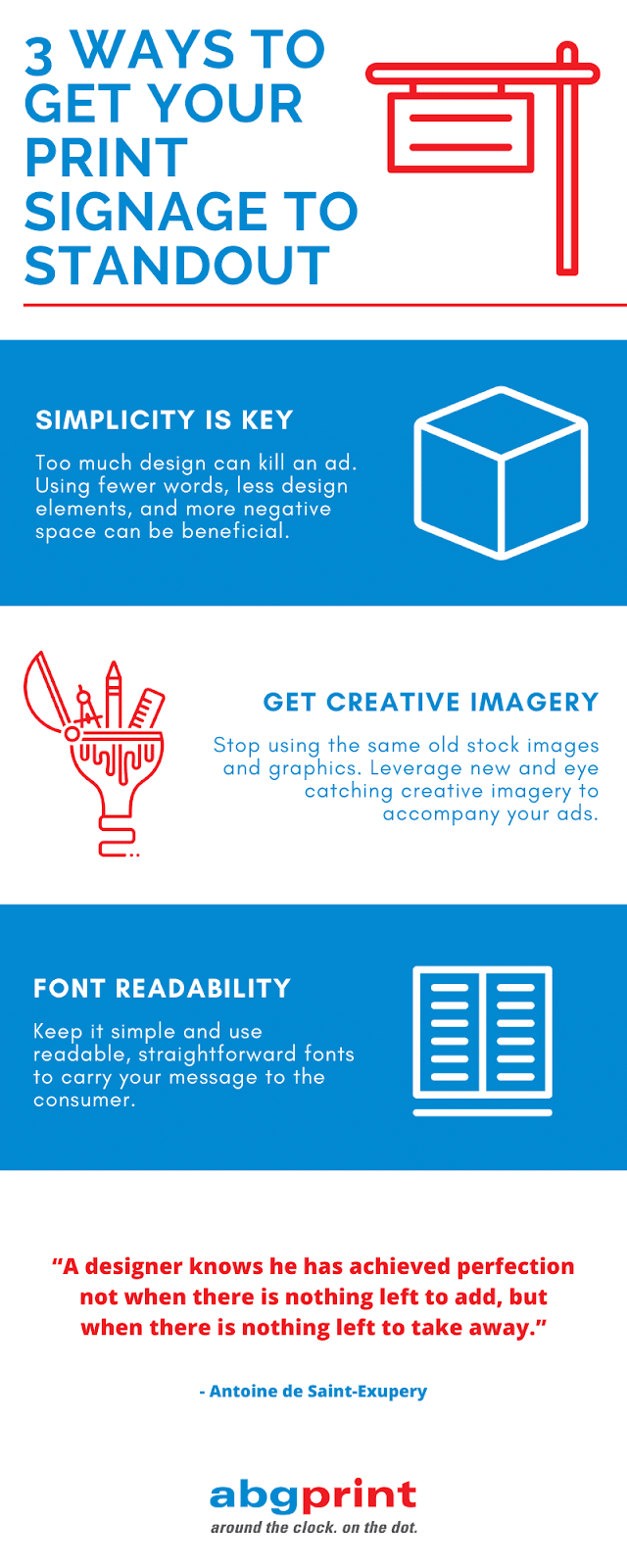
1. Less is More
A busy sign, is a forgotten sign. When signage tries to accomplish too much, consumer focus is lost. This leads to a disjointed message and an advertisement that gets lost in the shuffle.
A good way to get your print ads to stand out is to use fewer words and less design. Sounds crazy, but the brain likes simplicity. Try cutting out elements that are unnecessary or only further exacerbate the point you’re trying to make. The use of negative space can make an ad catch attention in ways that creative design cannot.
There is a famous quote by Antoine de Saint-Exupery that states: “A designer knows he has achieved perfection not when there is nothing left to add, but when there is nothing left to take away.”
2. Creative Graphics Pop
Not enough print signage features enticing visual aids. Stock photos and reuseable iconography are overused and predictable. Consumers are all too familiar with these images being used across businesses and industries. Therefore, little interest is paid.
It’s time to start investing in creative custom graphics to fit your narrative and advertisements. New and innovative imagery excites and captivates consumers in ways that repetitive imagery doesn’t. Hiring a good graphic designer or using your in-house design team to create unique, eye-popping visuals will help push your ads to the forefront. Strong visuals paired with thoughtful signage design can make your ad unforgettable.
3. Font Readability
One of the biggest issues with ads is readability. Marketers have about one second to catch the attention of a consumer before they move on. Not being able to quickly understand or read the display message is a major reason ads don’t make positive impressions.
While it’s certainly okay to mix it up and go outside the box, fonts need to be clear, evenly spaced, and readable from a variety of angles and distances. Stick to straight lettering, avoid script writing, and always do a field test with your ads before mass printing. A successful message isn’t found in the sophistication of the font, but in the attraction of the meaning.


